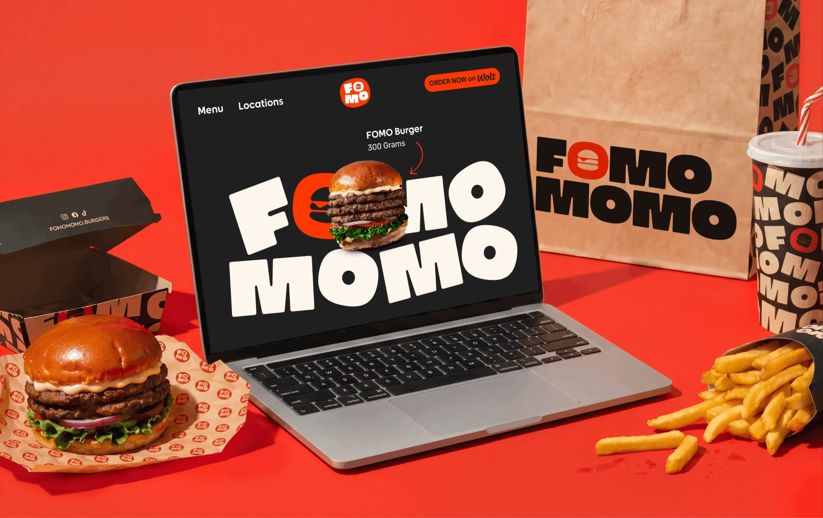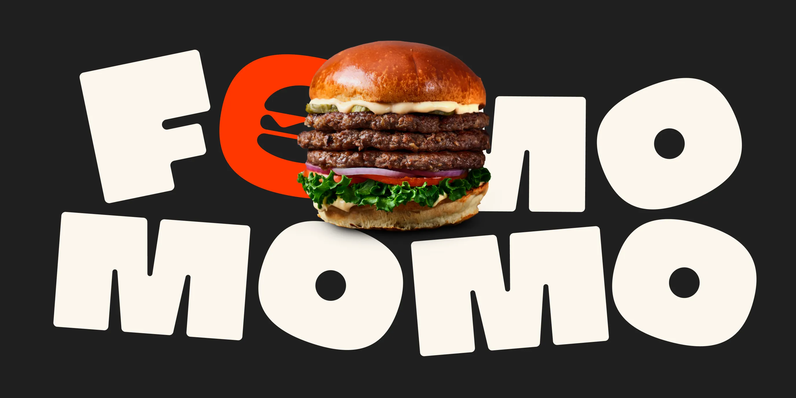
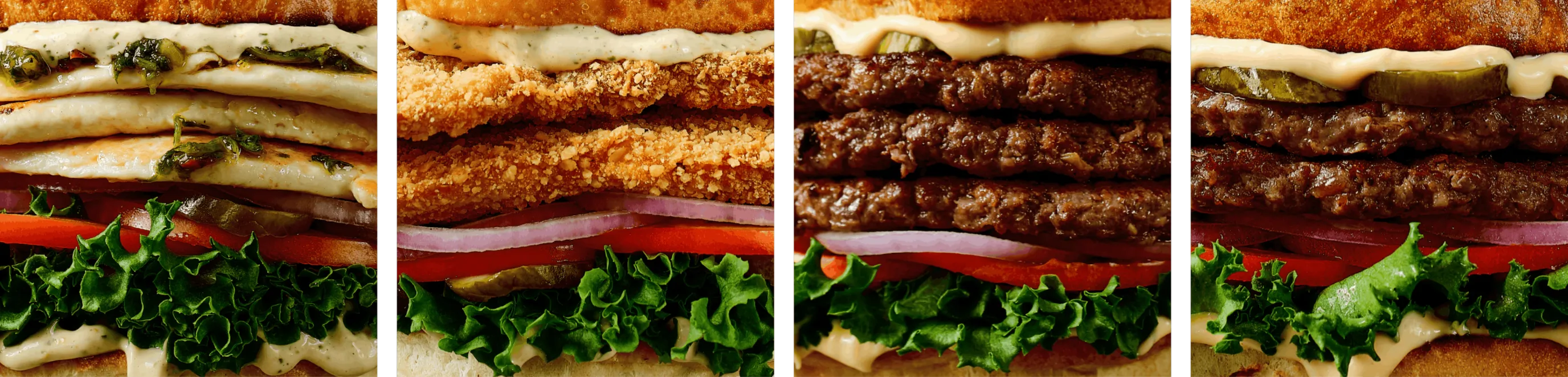
FOMO MOMO is a contemporary burger joint in Israel built around one core idea: bold flavor, instant desire, and an unapologetic love for comfort food. The project was conceived as a full brand universe, where every touchpoint —from logo and color system to menus, website, packaging, and in-store graphics— works together to amplify the feeling of FOMO: the fear of missing out.
The visual identity combines a strong, playful logo system with a high-contrast color palette, expressive typography, and modular layouts designed to scale seamlessly across digital and physical spaces. From the website experience to packaging, menus, and shop signage, the brand is designed to feel energetic, crave-driven, and instantly recognizable — both on the street and on screen.
Restaurant Openings
4
New Locations
3
Metropolitan Cities
Project Objective
- Brand Creation
- Brand Operations
Services
- Animation
- Branding
- Logo Design
- Social Media Assets
- Website Design & Development
Project Outcomes
- Created a Mechanism for Operations
- Established a Brand for Cultural Resonance
- Accelerated Growth
"We came to Craft & Root with a restaurant concept that needed a strong foundation in storytelling, and a design for scalability. The team provided this, and also made their own recommendations. They helped pull the story through all of our content, signage, packaging, and website. The team knows what sells; we're opening our 4th location now and haven't made any adjustments to the branding as we've scaled. The whole team is amazing."
Alon Levy
Owner
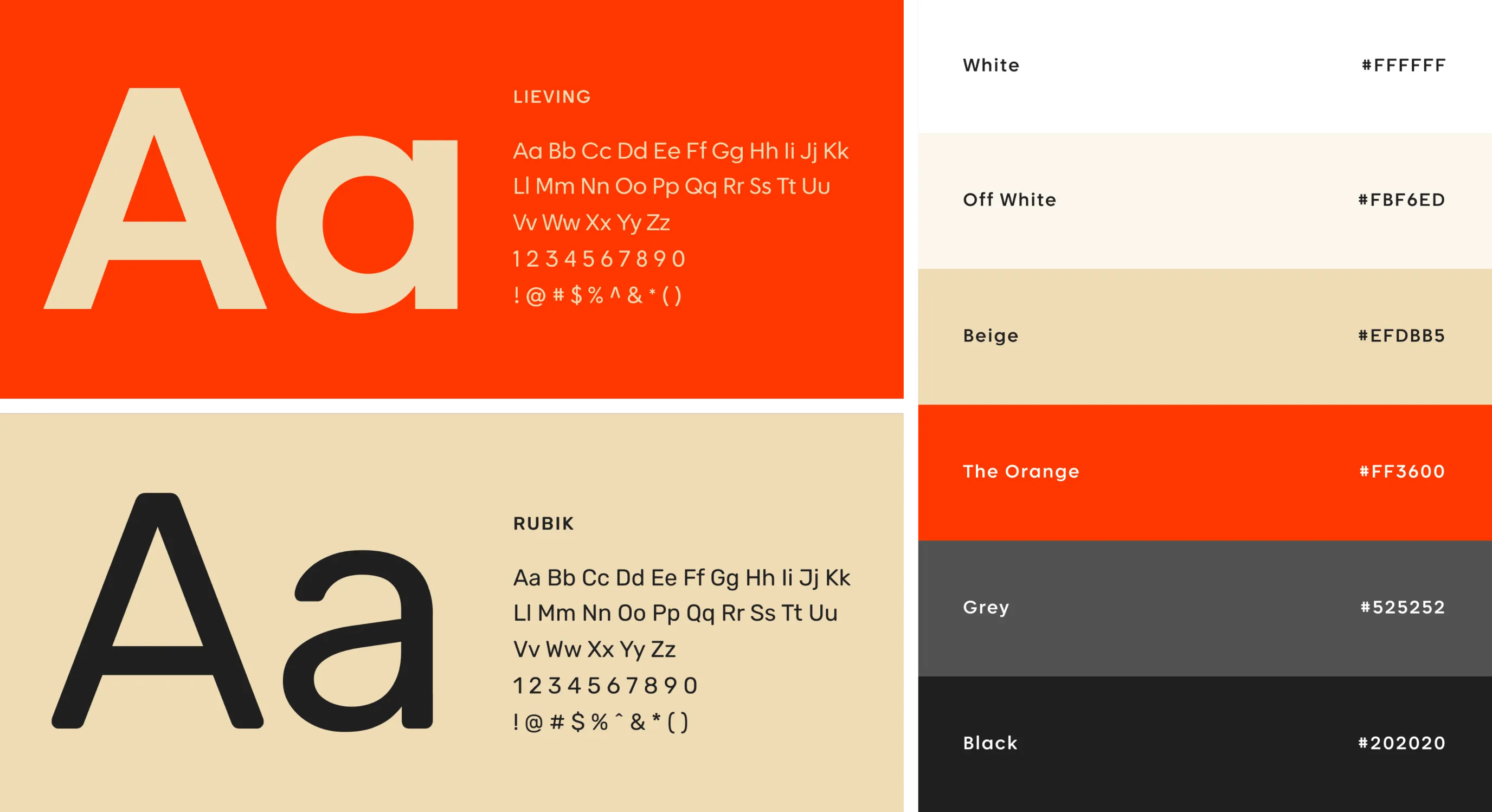
The branding for FOMO MOMO is bold, modular, and highly flexible.
The logo system is designed to adapt across multiple formats and backgrounds, maintaining strong recognition while allowing playful variations. Color and typography work together to create a loud but controlled identity that reflects the brand’s confident, fast-paced personality.
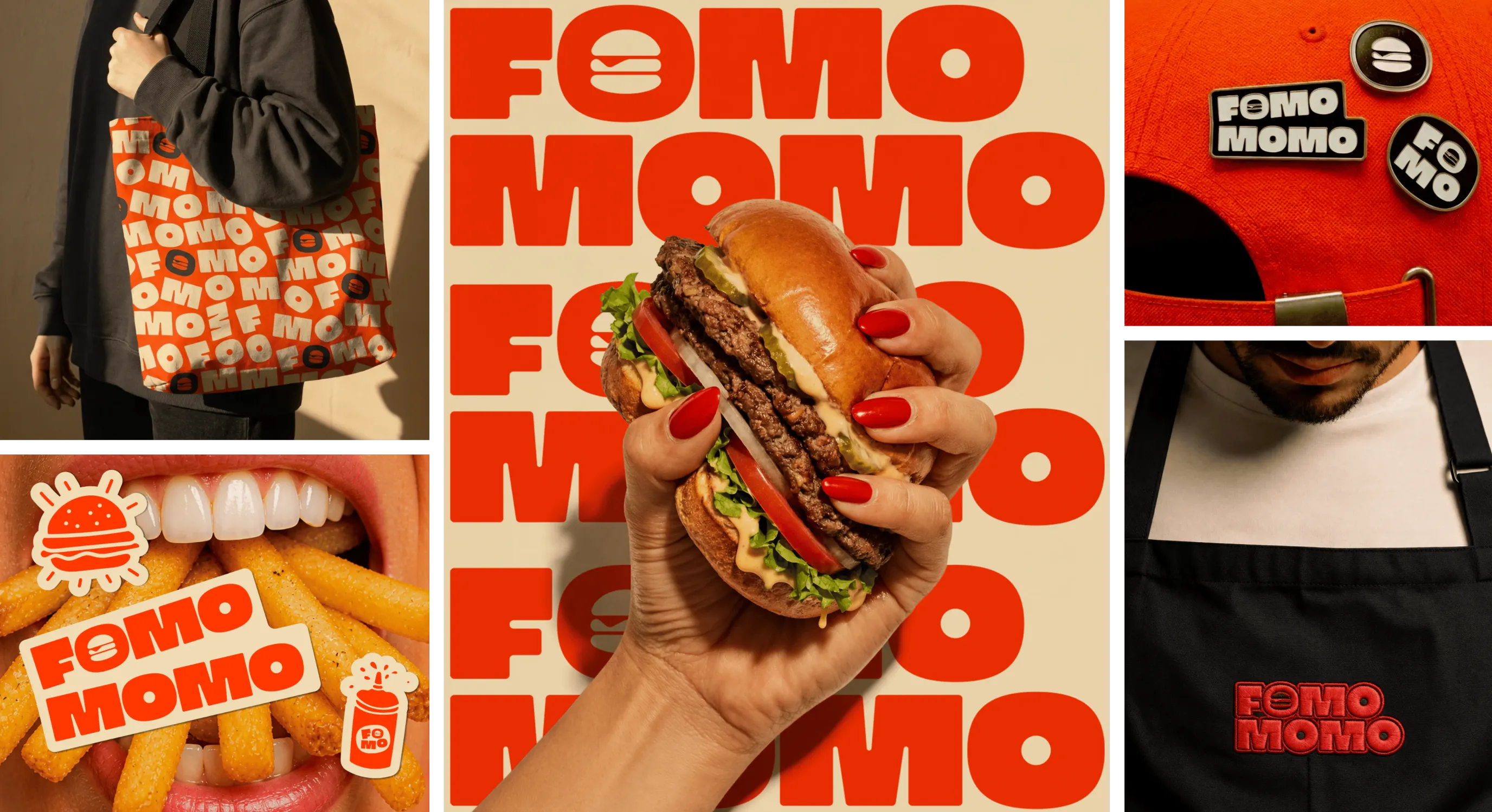
Packaging is designed as an extension of the brand experience.
Each element —boxes, bags, cups, and wrappers— uses strong graphic compositions and high contrast to stand out both in-store and in delivery contexts. The system is practical, scalable, and visually impactful, ensuring brand presence even outside the restaurant.
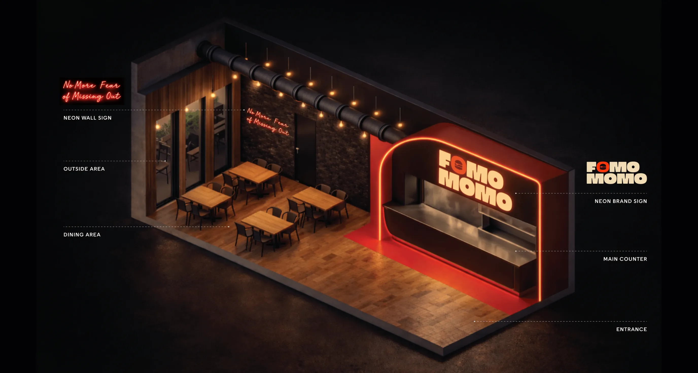
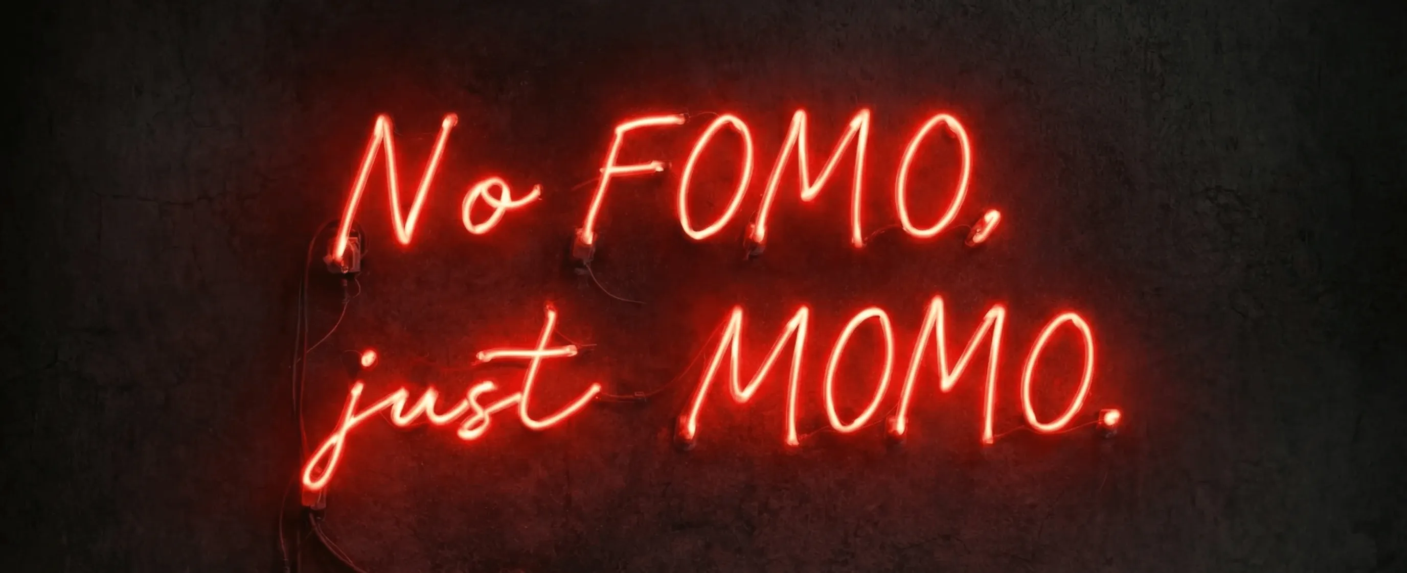
The brand extends into physical space through bold neon signage, transforming the restaurant into an immersive visual statement.
These elements reinforce identity, creating a strong, recognizable presence both inside and outside the venue.
The website translates the physical brand into a dynamic digital experience.
Bold typography, strong color usage, and motion elements reinforce the identity while guiding users through the menu, locations, and brand story. The design is optimized for mobile-first interaction, reflecting how users discover and engage with the brand today.