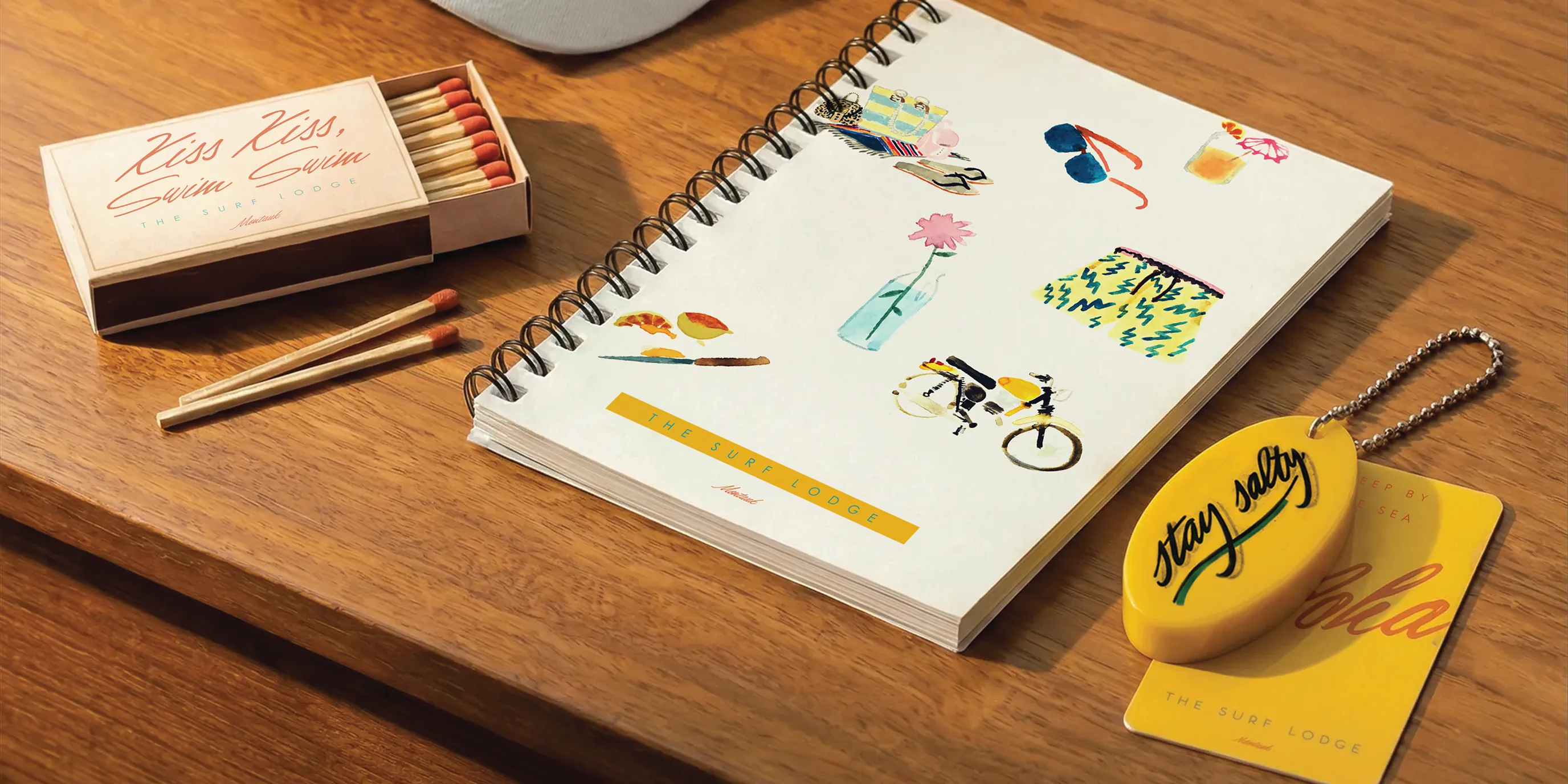
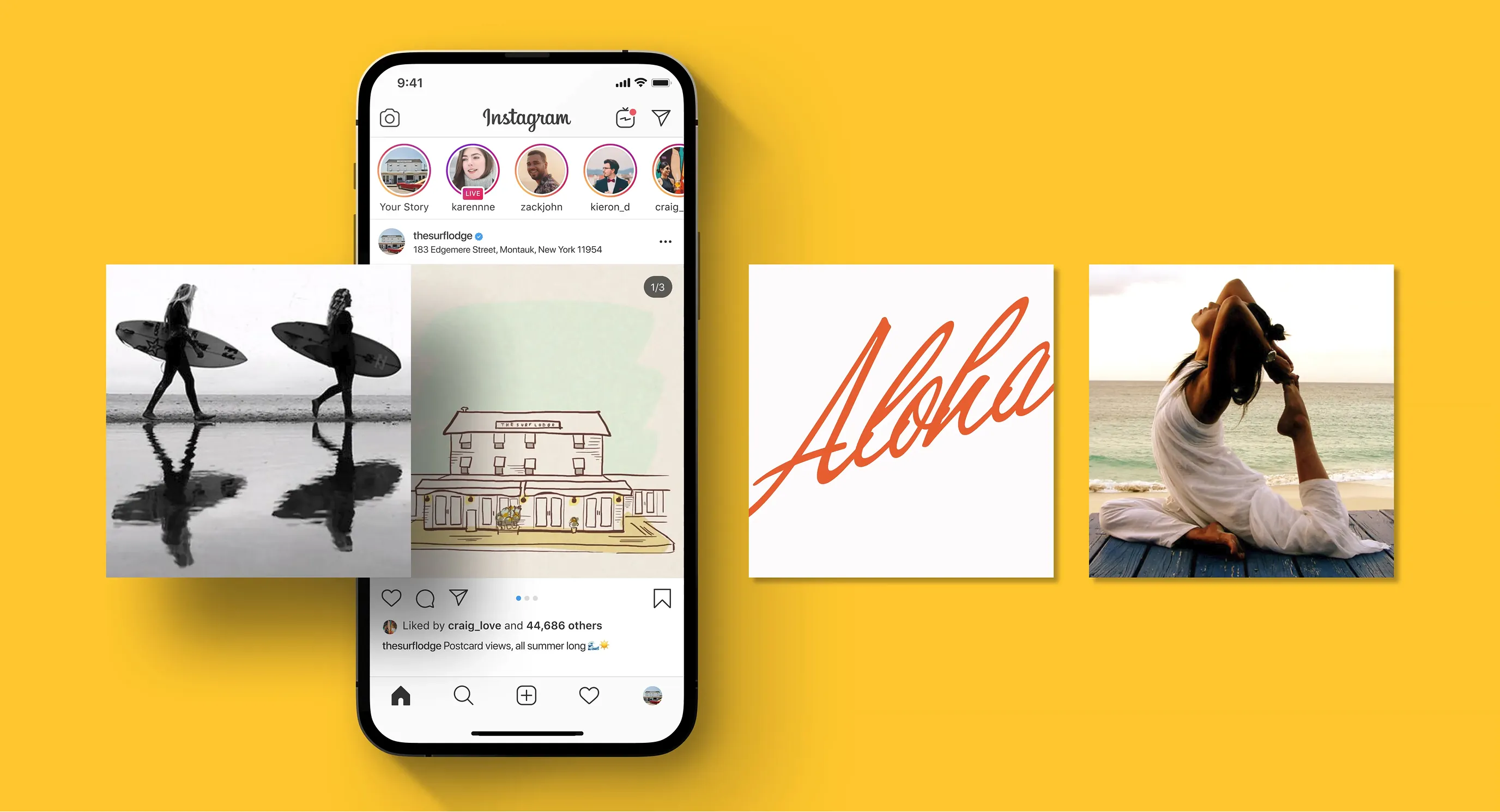
We partnered with The Surf Lodge to create a cohesive brand experience across both digital and physical touchpoints.
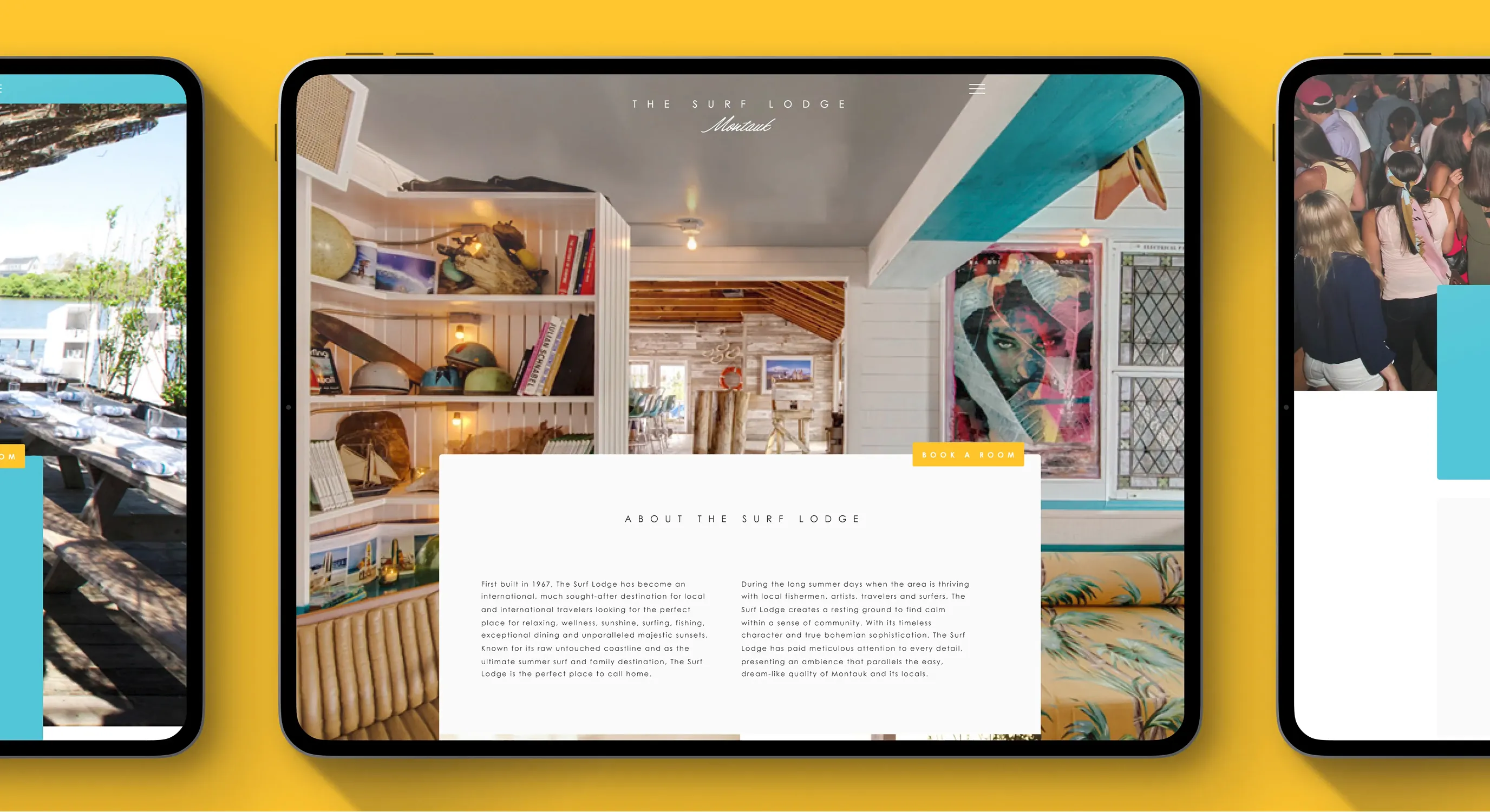
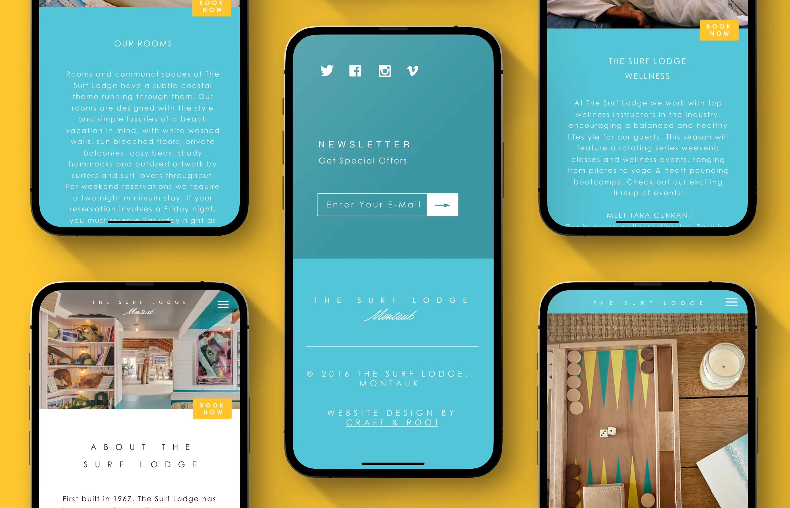
As a world-class summer destination for NYC visitors and global travelers alike, the property needed visuals that captured its full spectrum — from laid-back beach days to high-energy nights. Inspired by their clean, minimalist, and highly recognizable logo, we extended that visual language across the entire brand ecosystem.
The core challenge was balancing dual identities within a single, unified system. The brand needed to embody a relaxed, sun-soaked surf lifestyle — think wide-brimmed hats, oversized sunglasses, and a slow coastal pace — while also capturing the “work hard, play hard” energy that defines The Surf Lodge’s nightlife and cultural relevance. This had to translate seamlessly across digital platforms and on-site guest experiences.
Project Objective
- Brand Operations
Services
- Digital Experiences
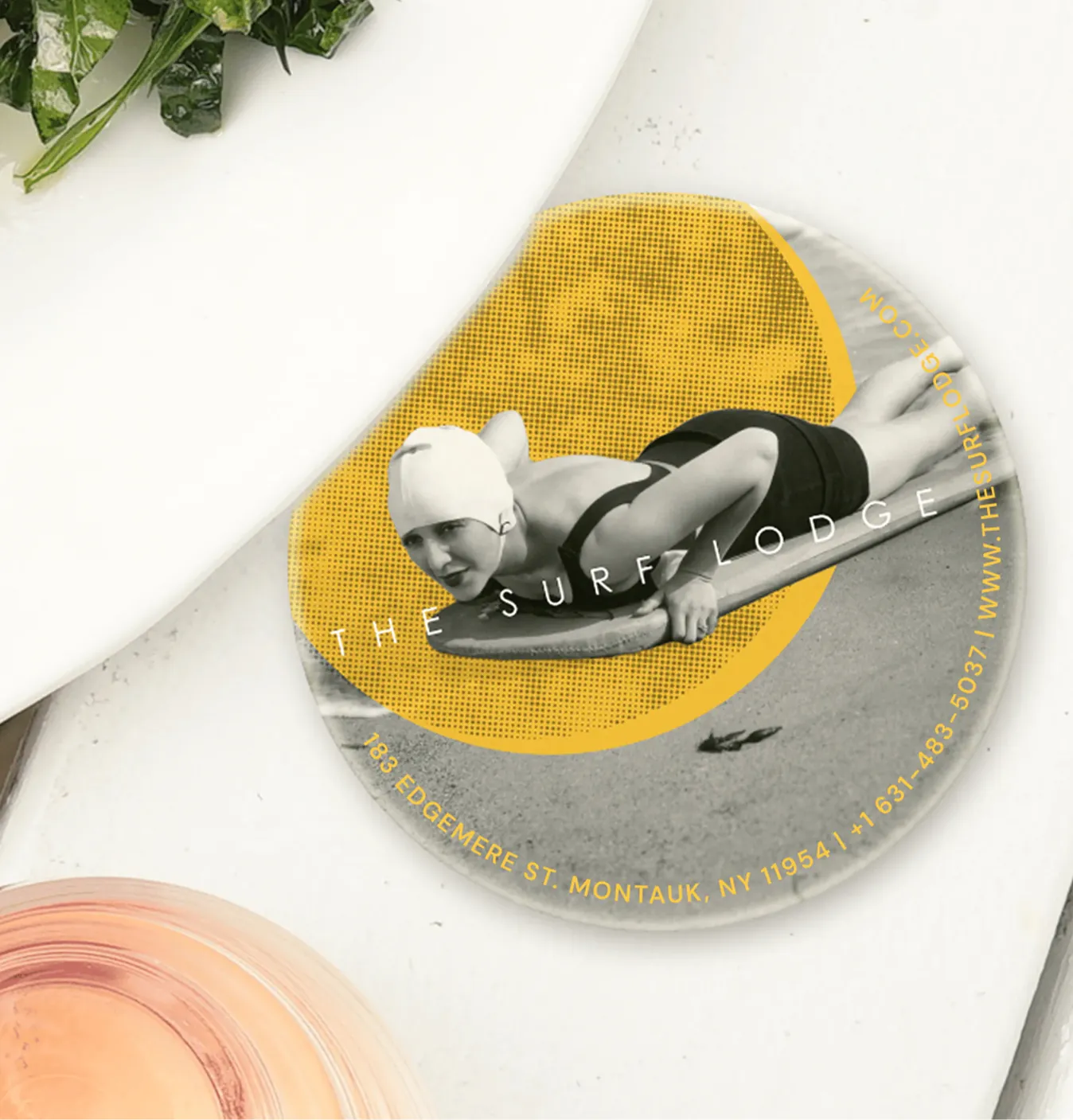
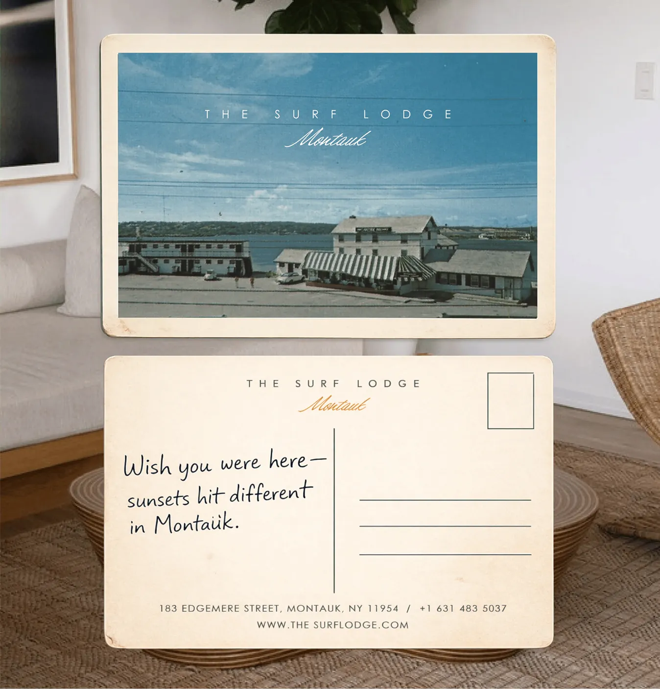
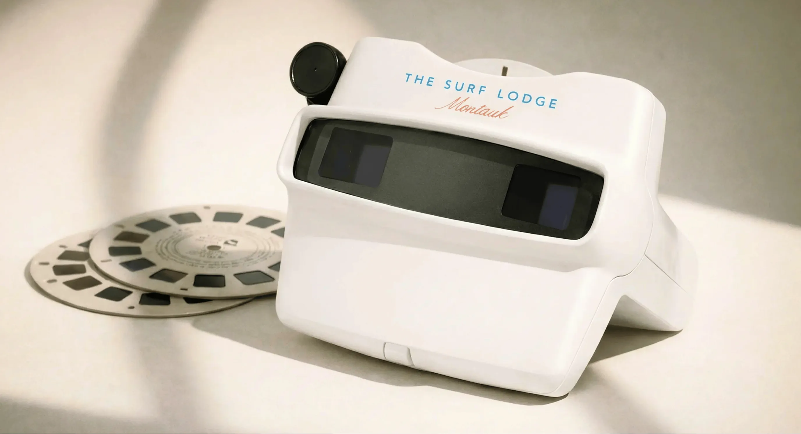
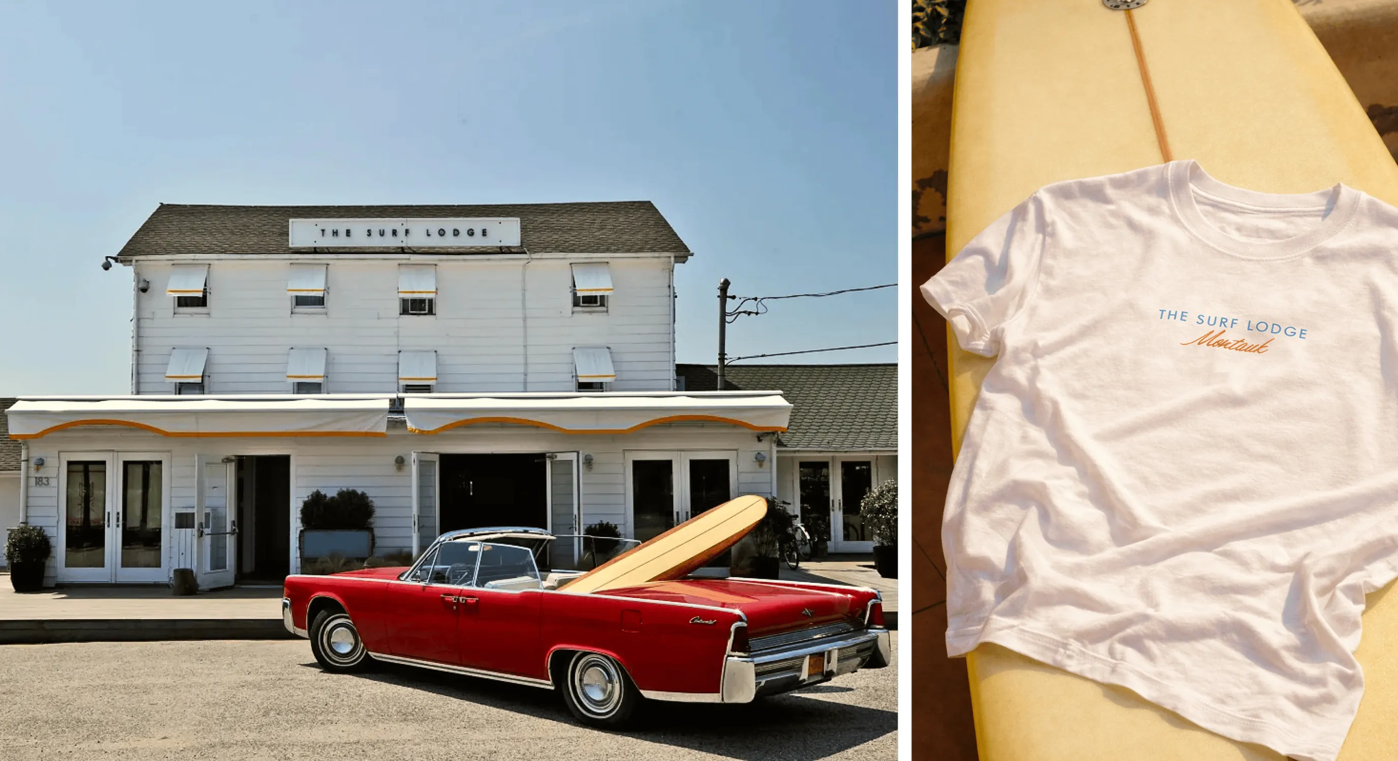
- On-Site Collateral
- Implementation & Rollout
Project Outcomes
- Created a Mechanism
- for Operations
- Tailored Visuals for Cultural Resonance
- Accelerated Growth
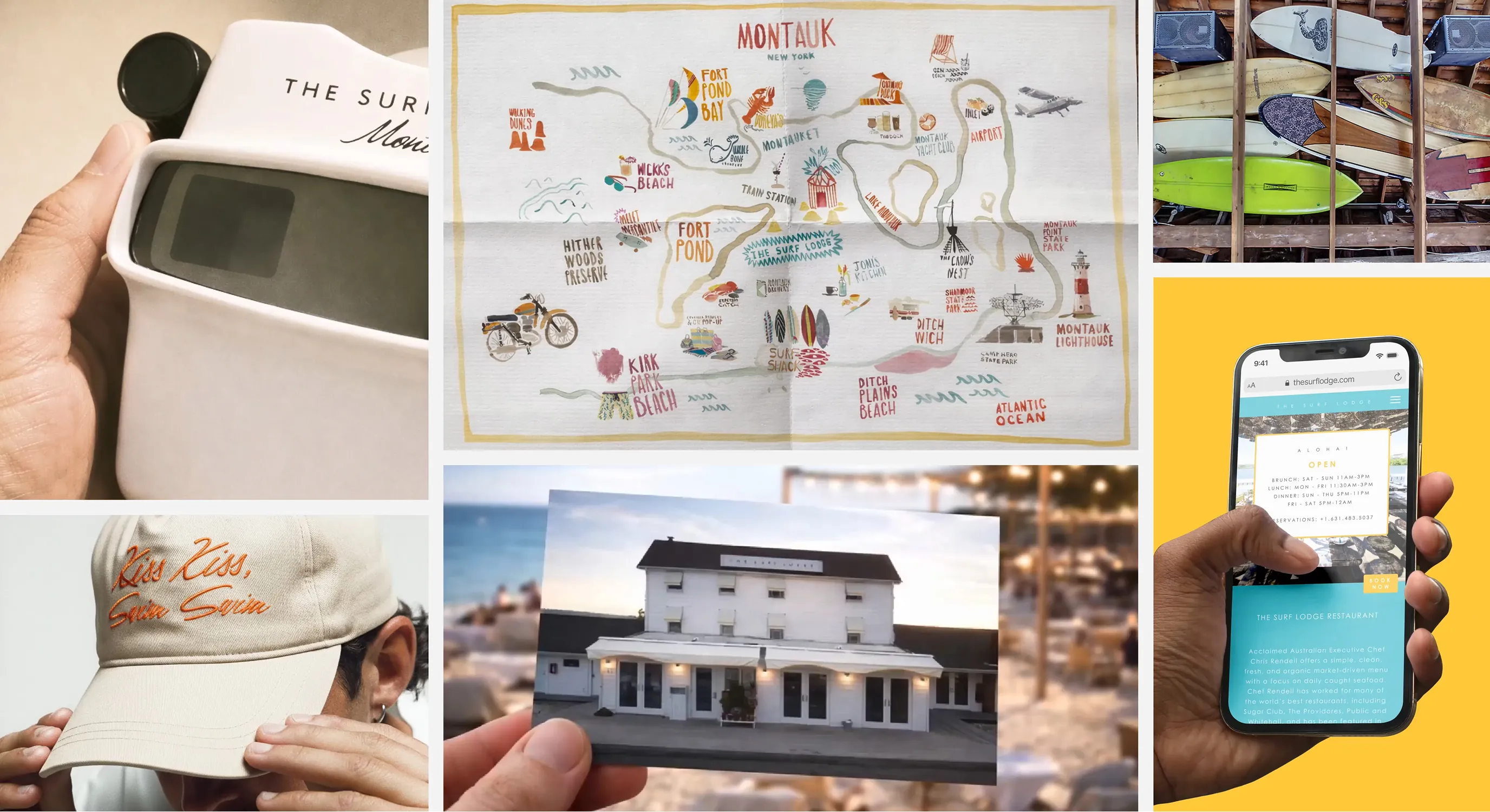
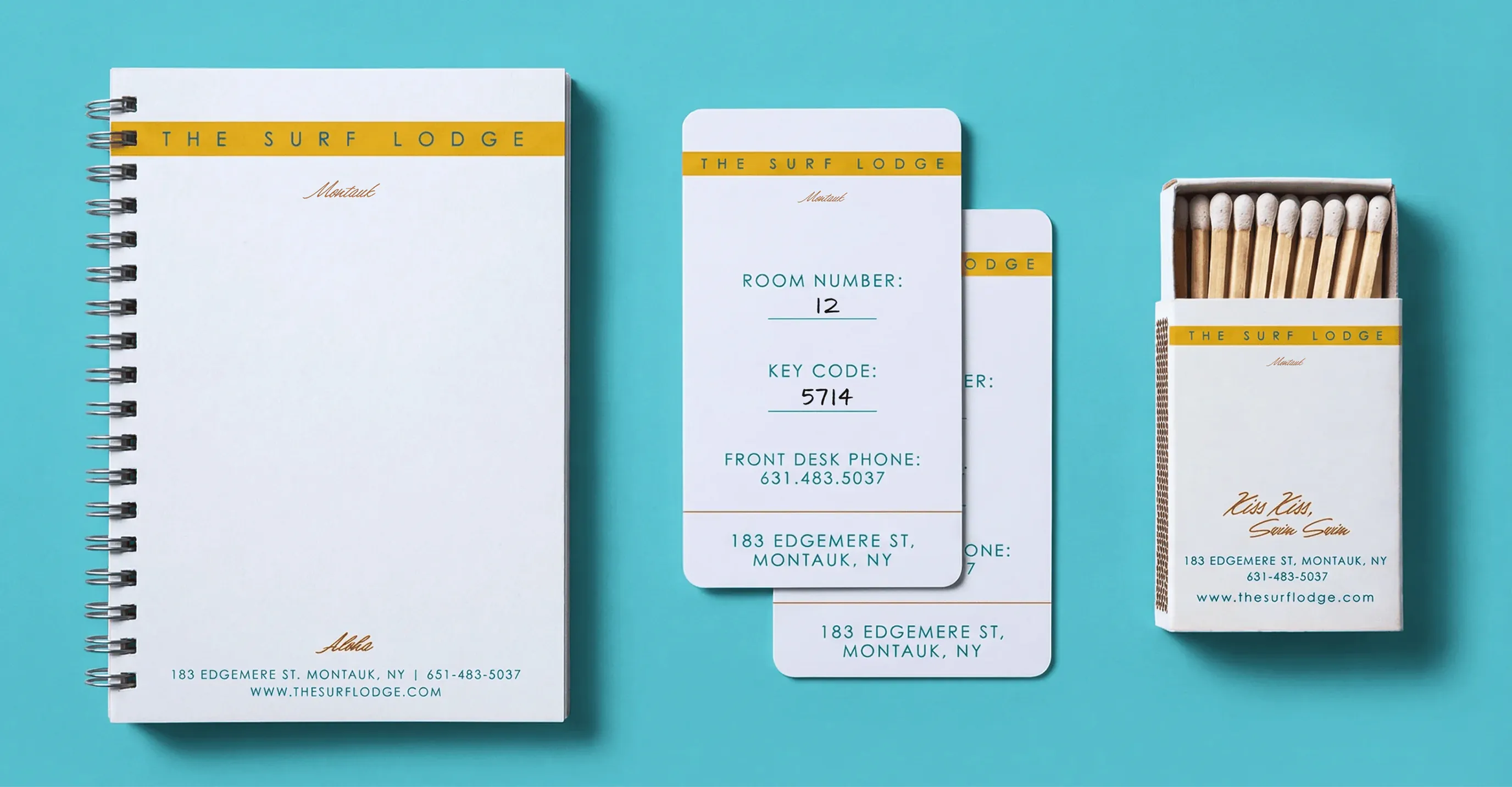
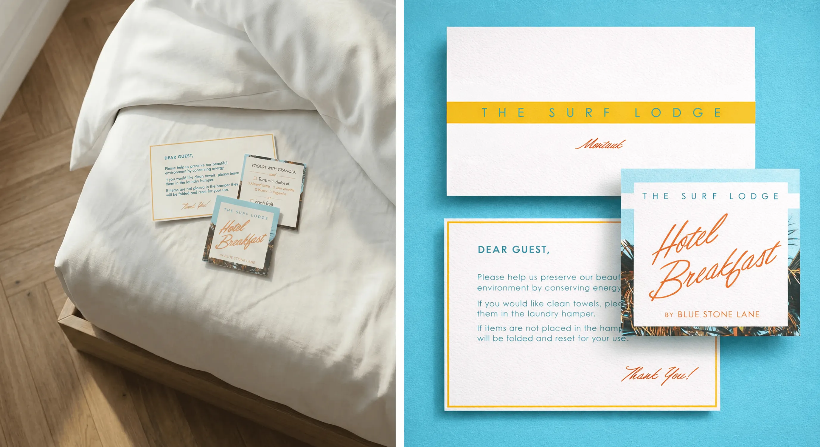
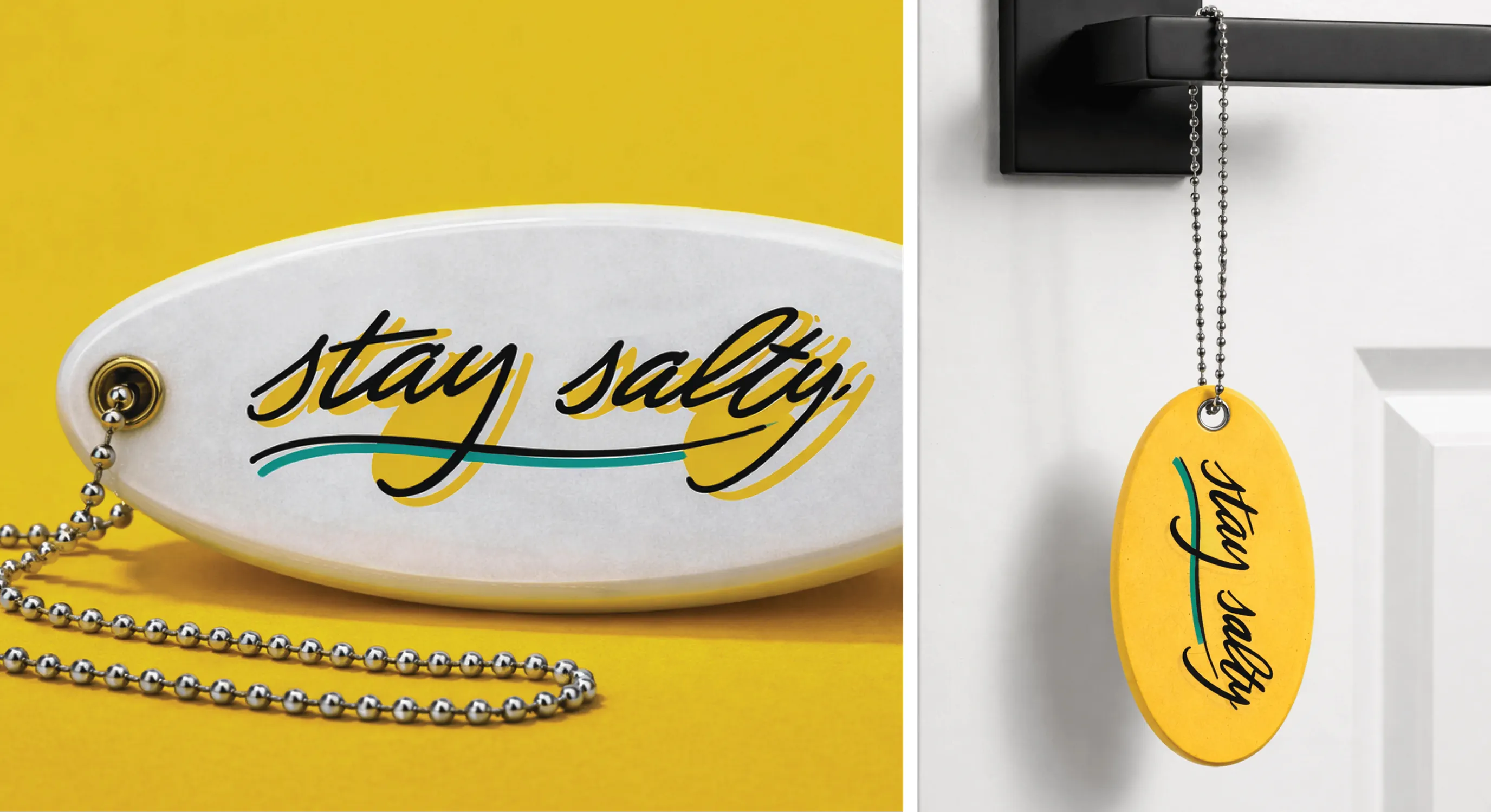
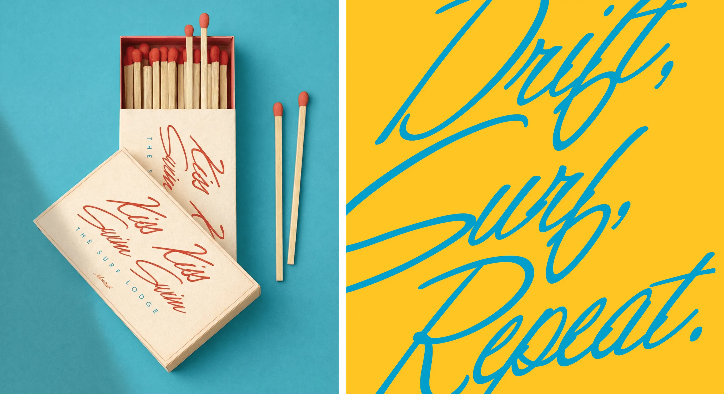
The result was a cohesive, multi-sensory brand experience that reflected both the relaxed sophistication and vibrant energy of Montauk.
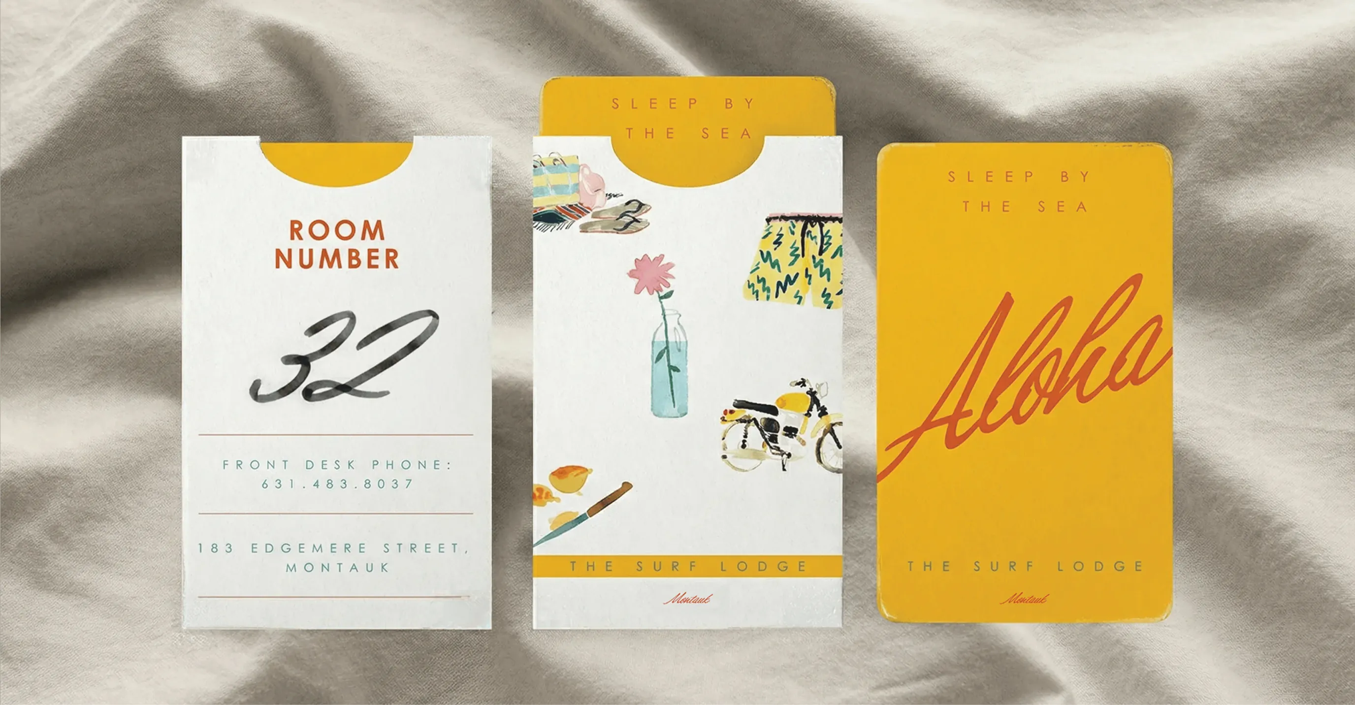
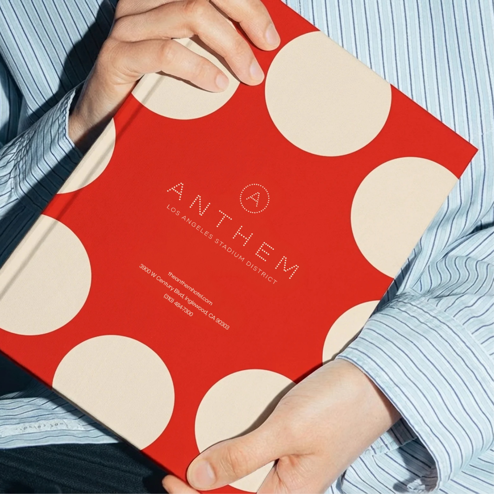
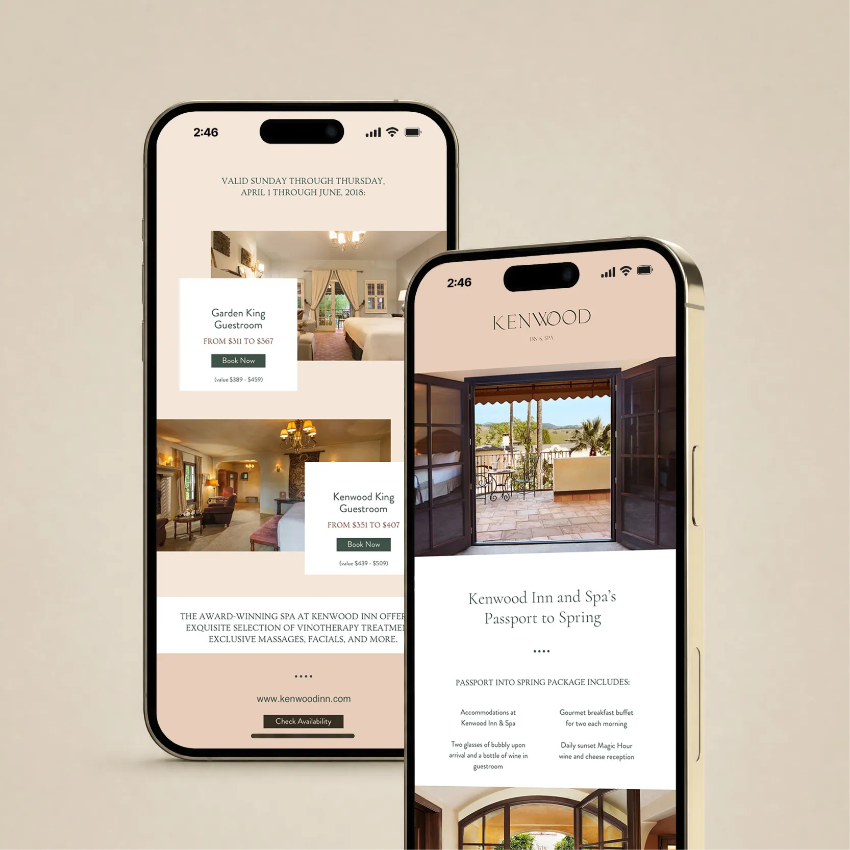
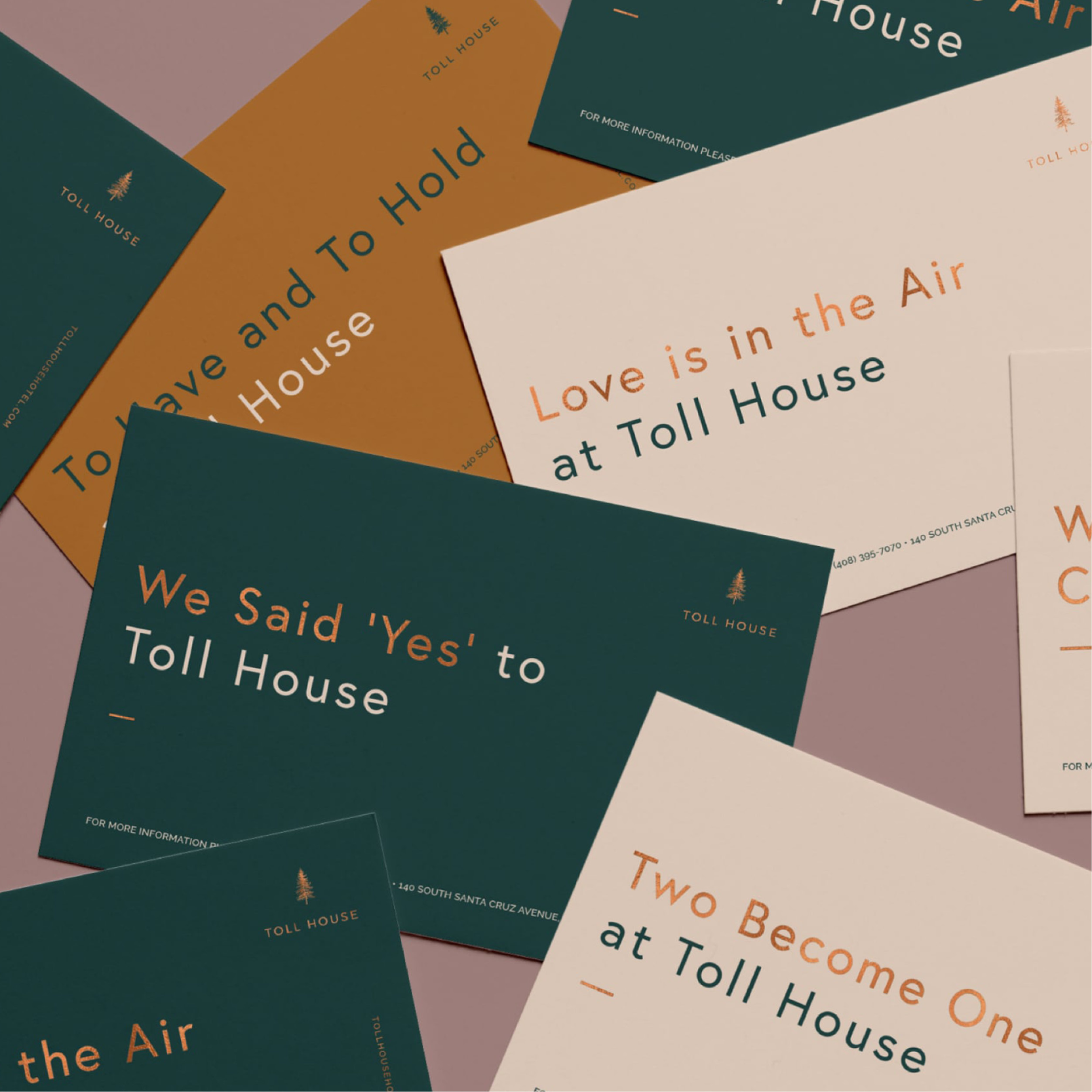
Every touchpoint — from digital interactions to in-hand materials — reinforced The Surf Lodge’s identity, creating a seamless guest journey that felt both elevated and distinctly personal.
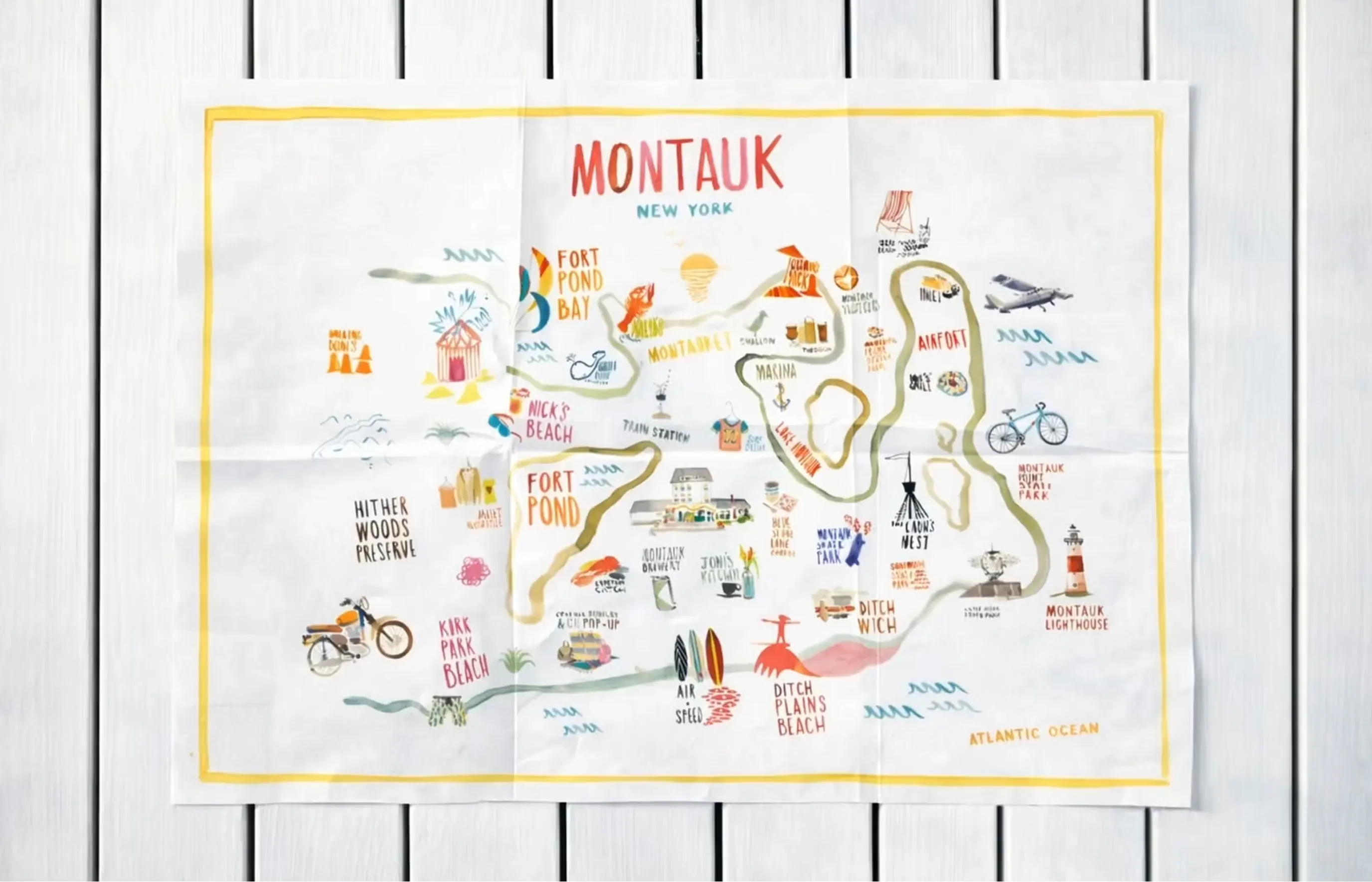
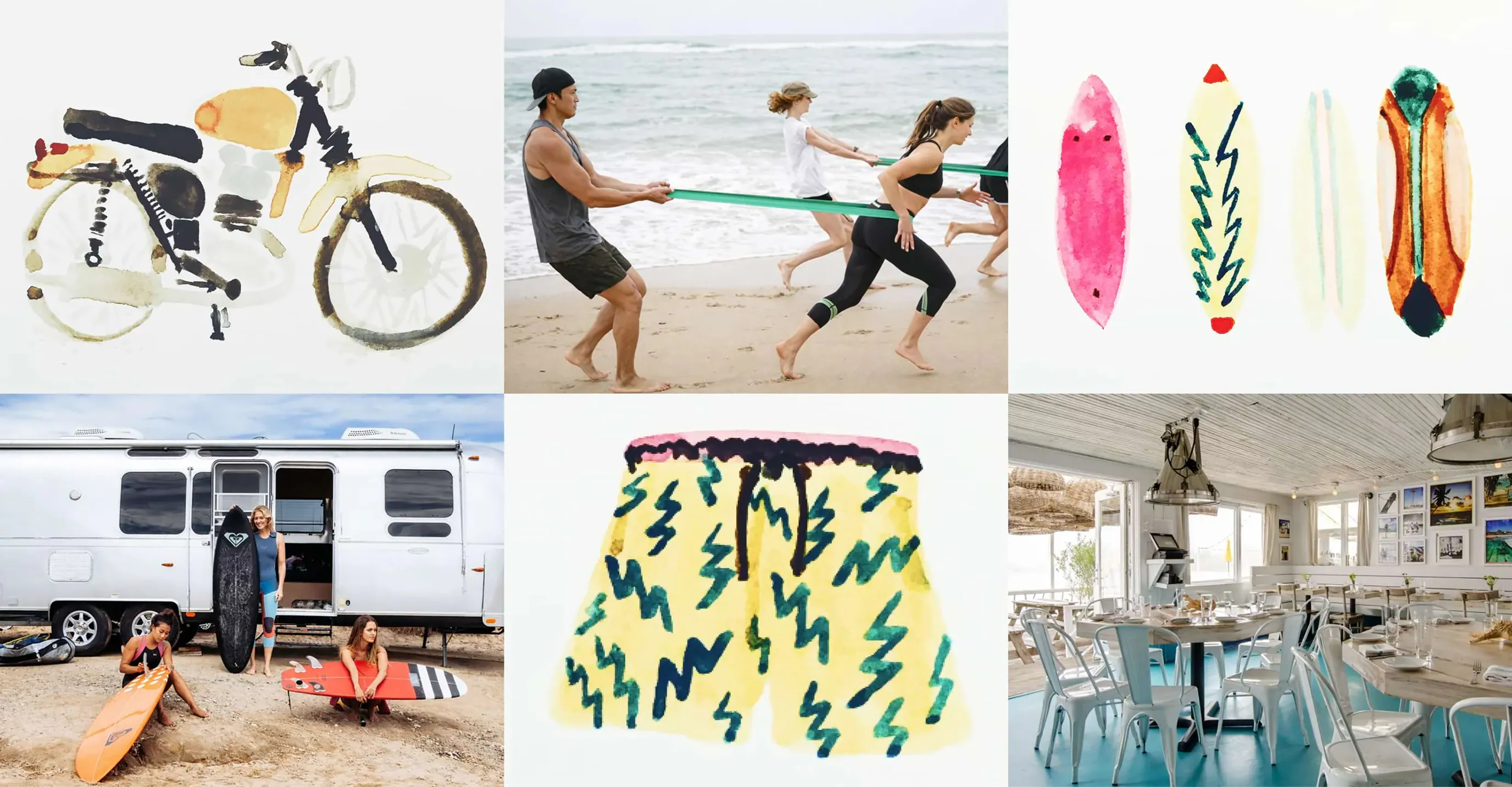
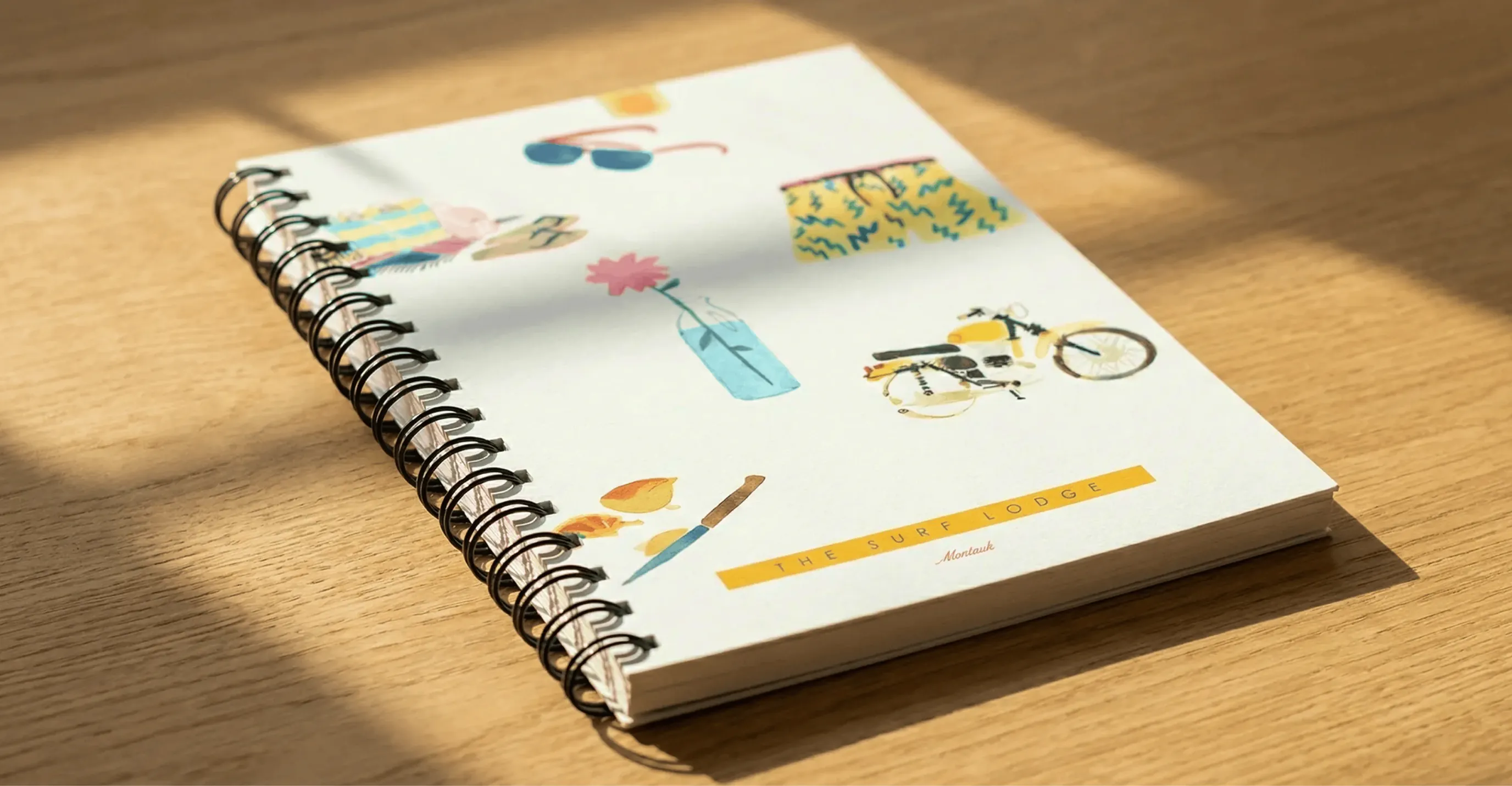
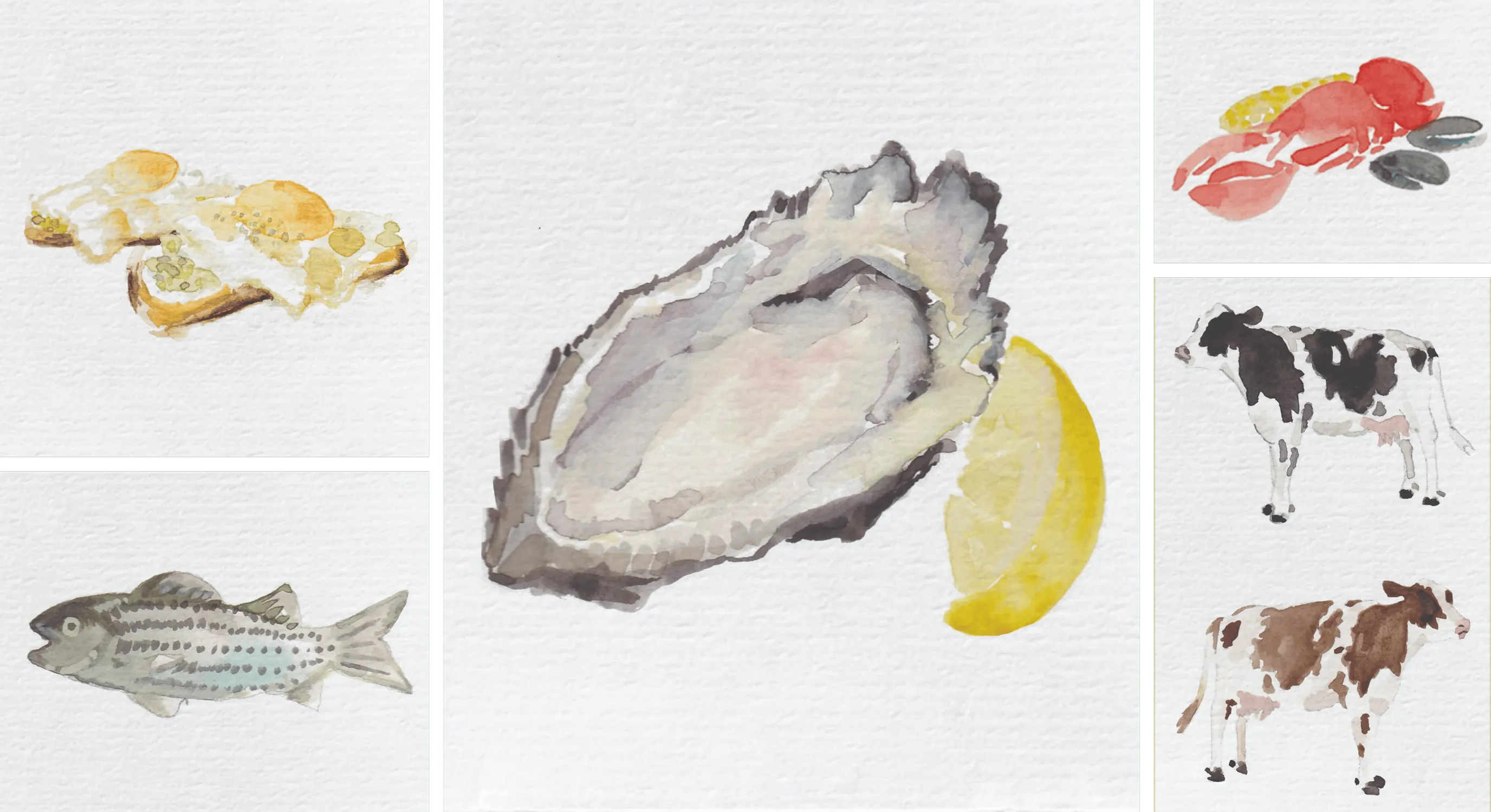
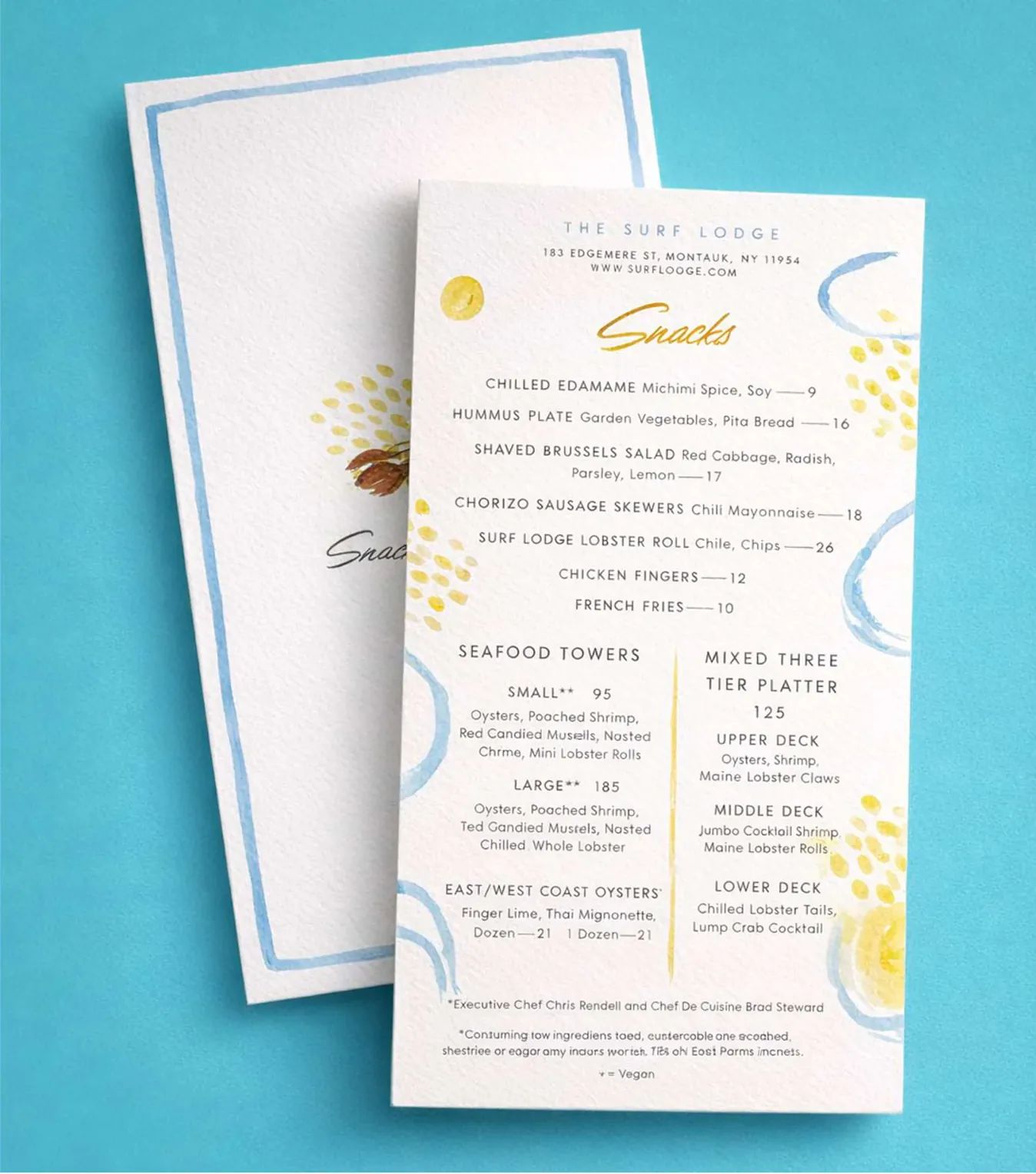
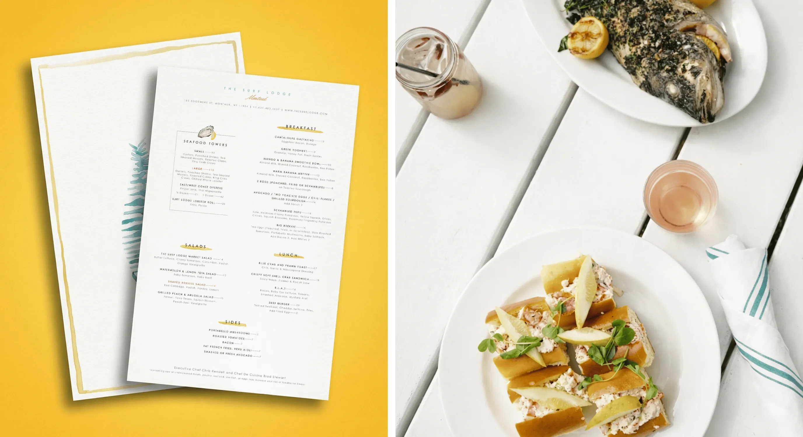
A custom watercolor illustration system was created to introduce a playful, seasonal storytelling layer — reinforcing the brand’s relaxed, sun-washed, coastal identity.
It began with an area map, and was so well received, the style was applied across other physical collateral like menu designs for a limited-edition feeling.
Get in touch