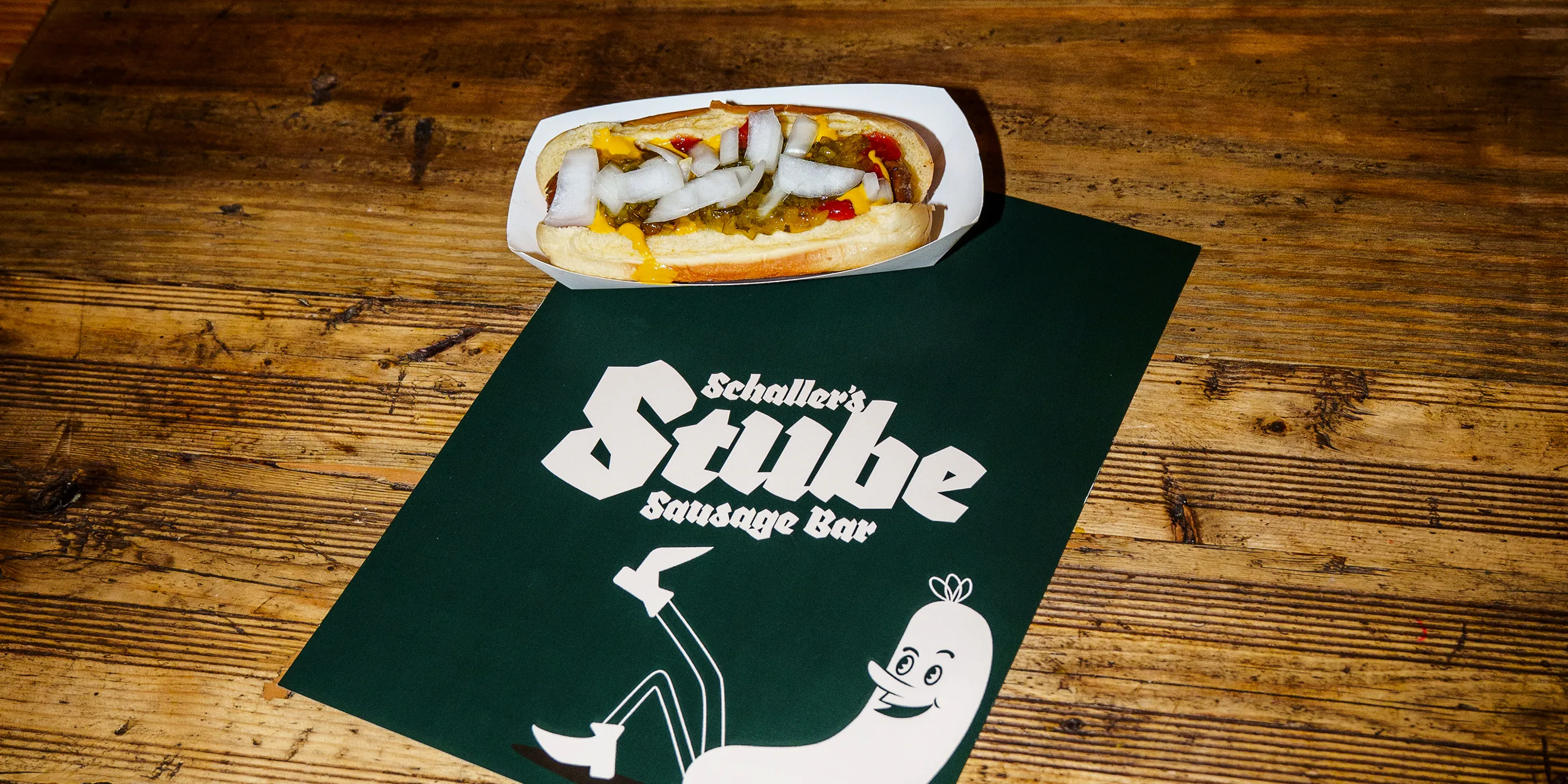
/Stúbe/ Stube is a German word that translates to "room," "parlor," or "living room". Historically and culturally, it refers to the warm cabin-like spaces in Alpine and German-speaking regions. However, in the Yorkville neighborhood of NYC it refers to a delicious eatery known for beer, brats, and pretzels. The challenge was that it had outgrown its previous branding.
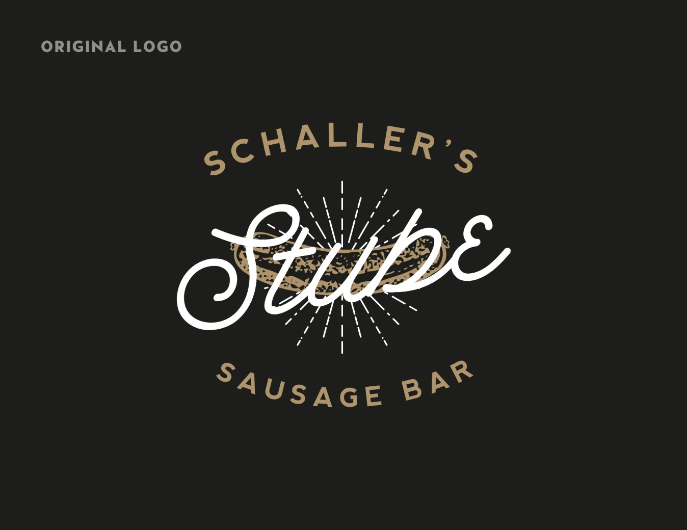
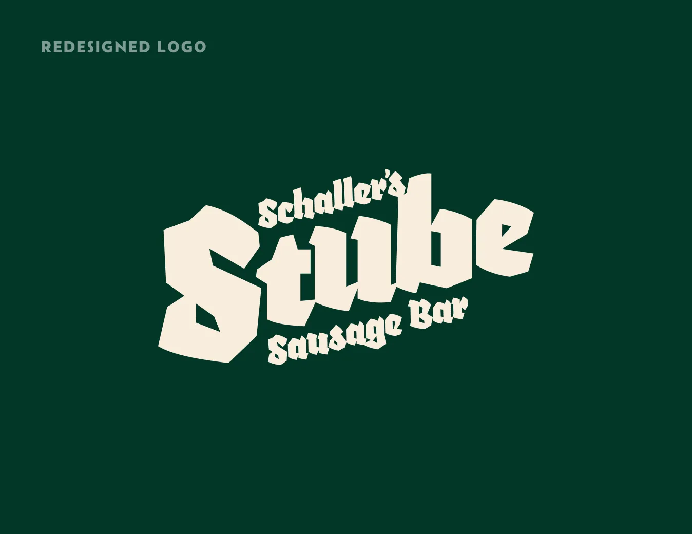
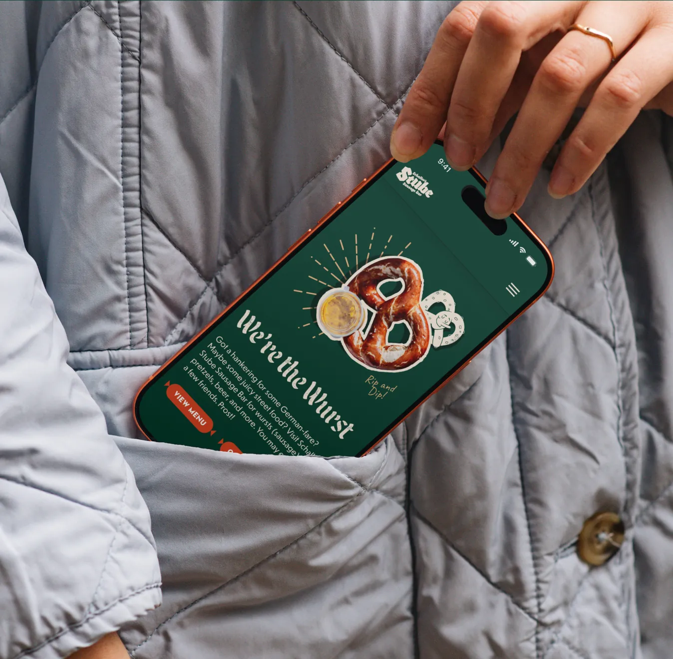
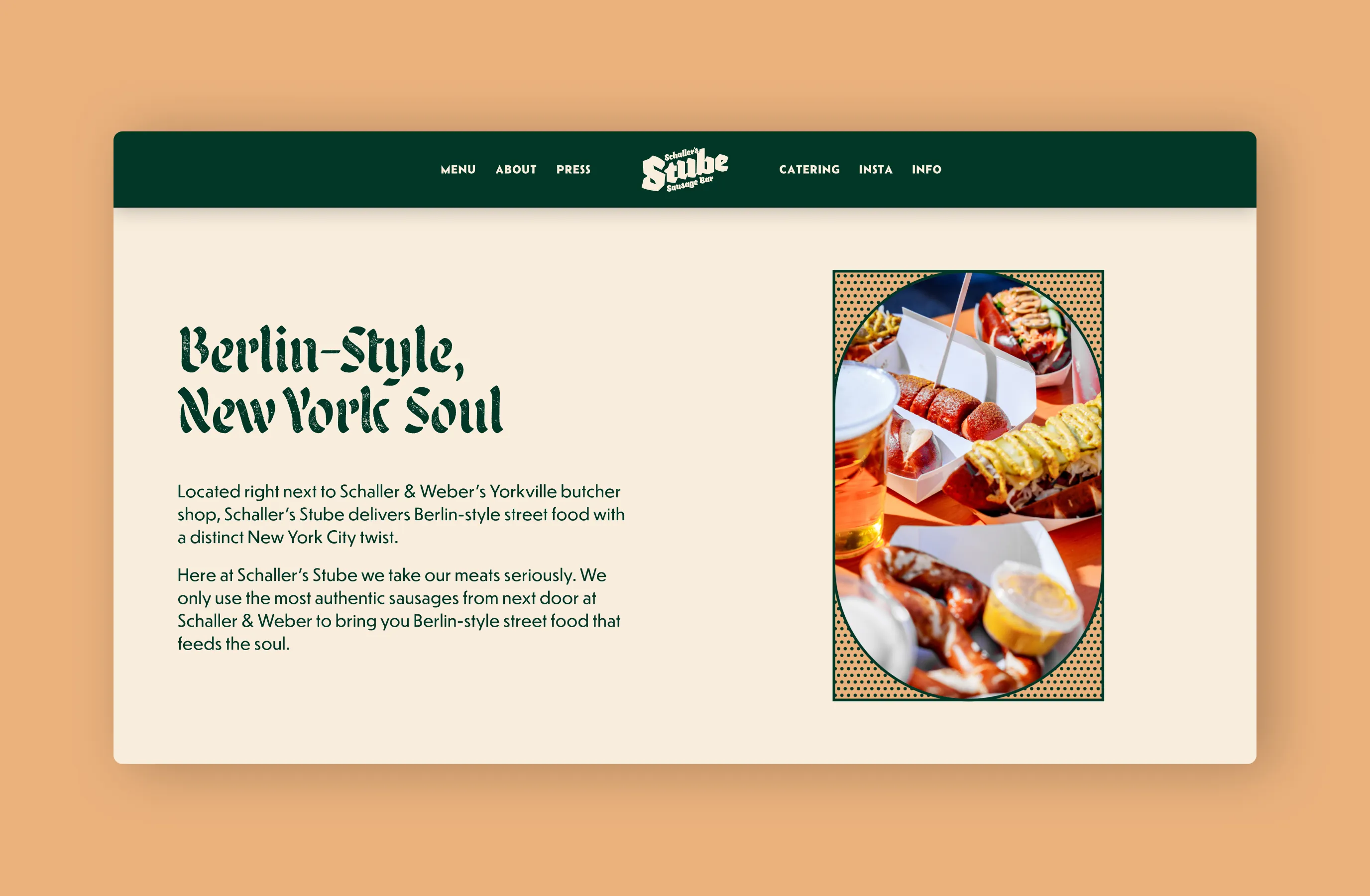
The VP of their parent company Schaller & Weber approached us to help bring Schaller’s Stube Sausage Bar brand into the modern day—a total overhaul. With that, and after a visit or two, we rebranding the visual identity, established a new tone, and redesigned their web presence to match their cheeky real-life vibe.
Project Objective
- Brand Ascension
- Brand Operations
Services
- Visual Identity Systems
- Digital Experiences
- Physical Brand Touchpoints
- Brand Standards & Guidelines
Project Outcomes
- Established Brands for Cultural Resonance
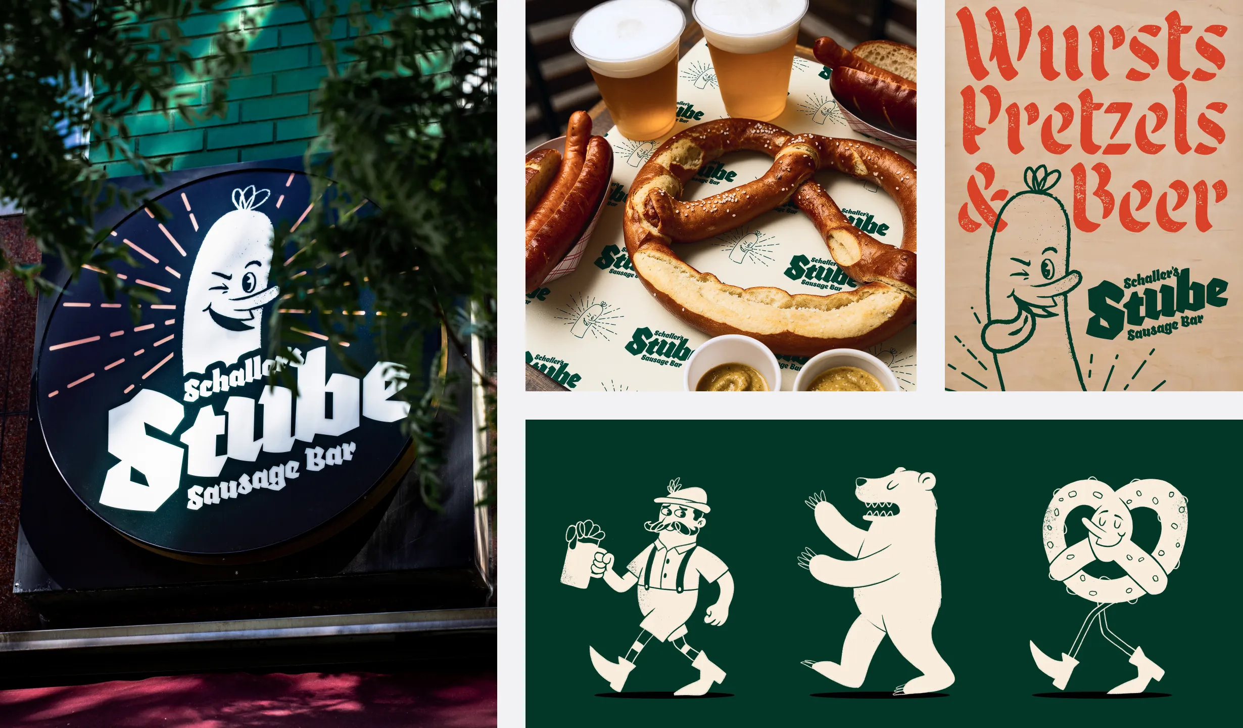
The branding of Schaller’s Stube Sausage Bar represents a rebirth of the hole in the wall eatery.
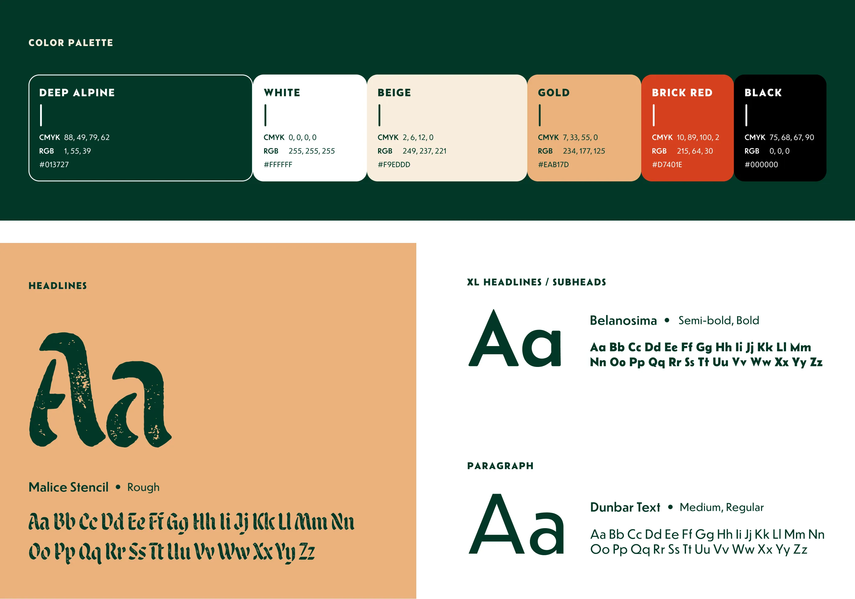
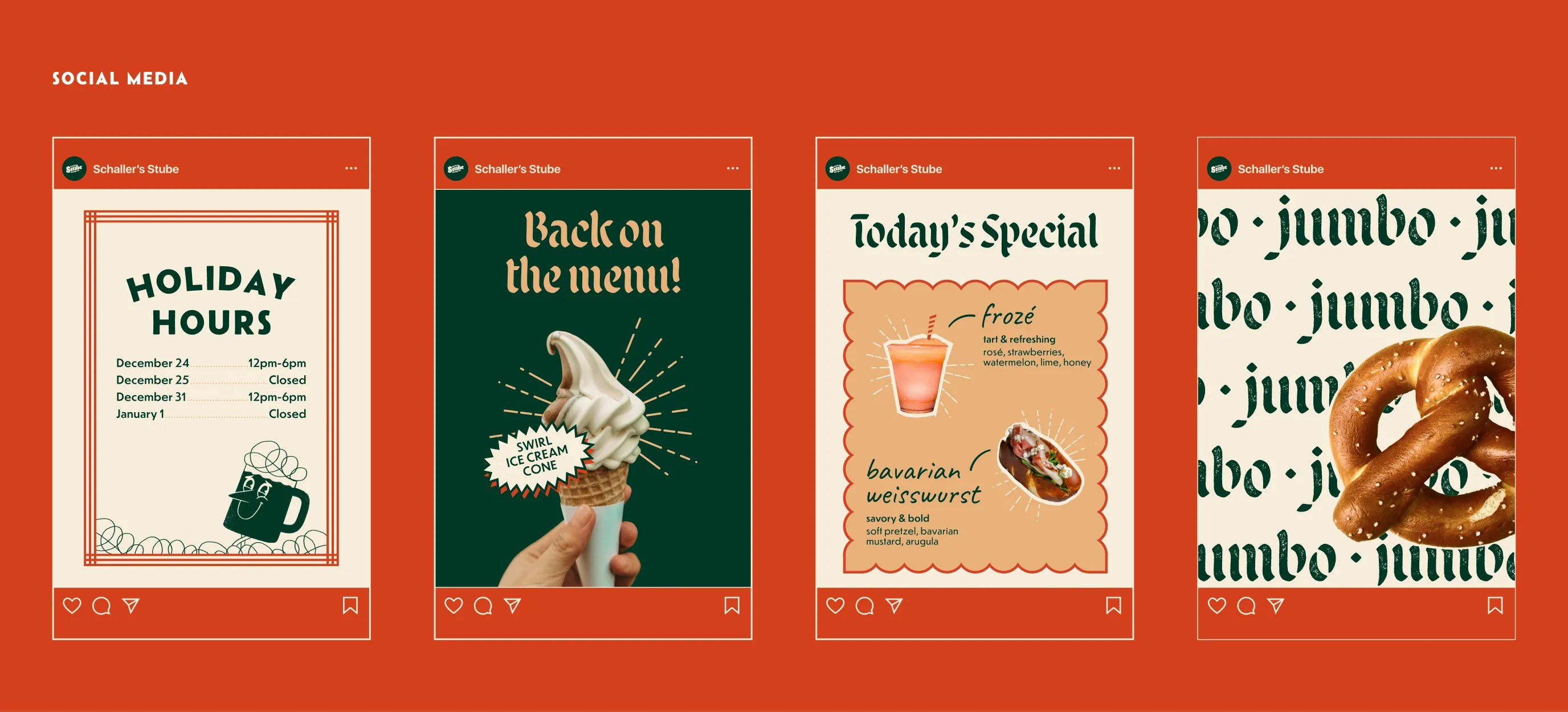
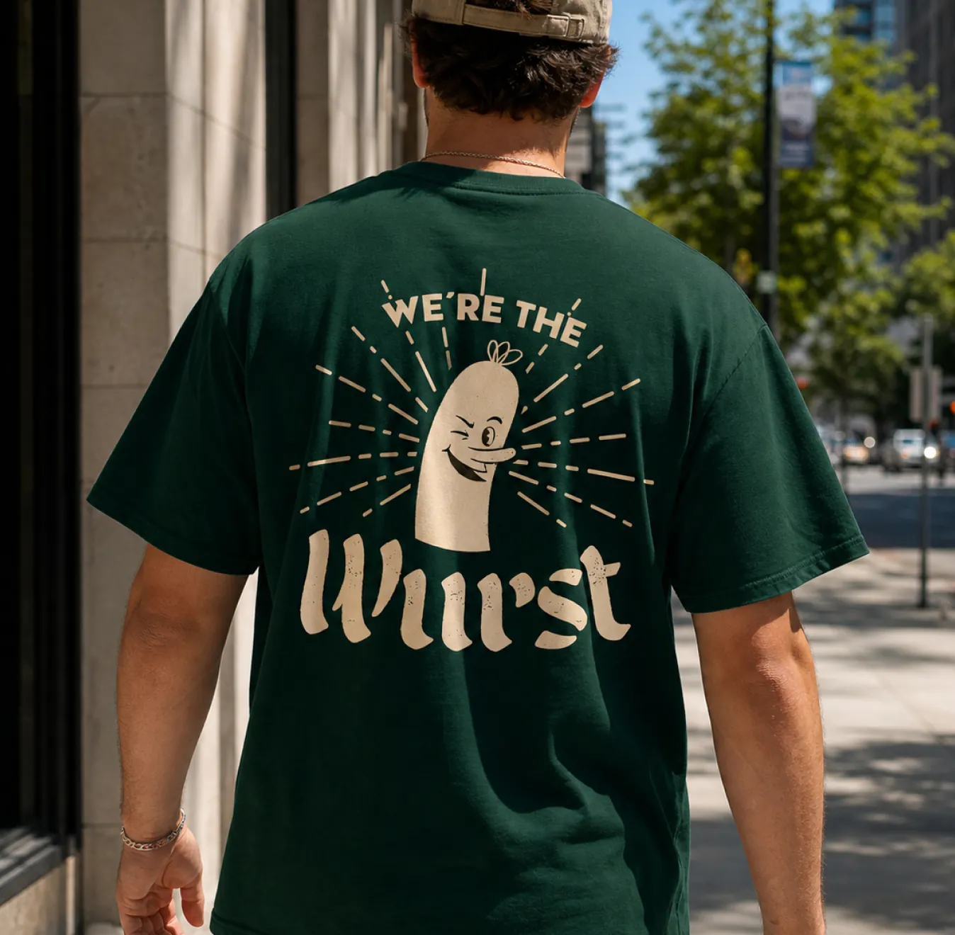
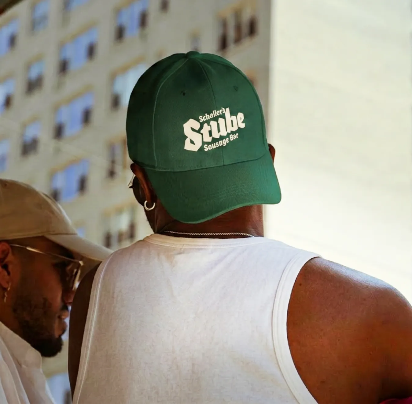
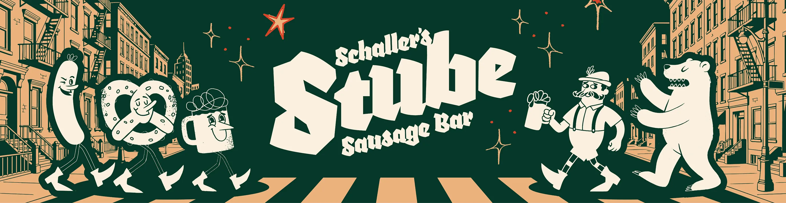
It leans in to the fun nature of the establishment and its neighborhood while paying tribute to its German origin. Textured blackletter typography reinforces the brand’s German heritage, while the simple color palette gives the custom character illustrations a place to shine.

Get in touch